Wednesday, August 29, 2012

Layout continued...

Liking the layout but playing with the image. 
I.E. What one to put in; where to put it; where to put the caption; etc.

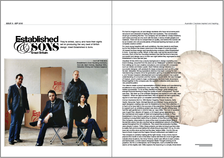


The third option is what I'm leaning towards. I feel that the image breaks up the 'square' feel of the layout and ties in with the image on the previous page with the black and red colour.

Monday, August 27, 2012

Second result

Not too sure if I'm doing this right or wrong. Trying to follow the rules but be creative. Finding that the 4 pager has soooo much text that being creative yet still having all the body copy and images is a challenge...


Image size still playing with...


Sunday, August 26, 2012

Coming along

Slowly but surely...


First layout for 4 page article, liking the 2 column feel.

Saturday, August 25, 2012

Layouts & Designs

The layouts and designs for both articles and contents have taken some time. To allow for balance, grid, hierarchy and all that good stuff to flow together nicely.

I feel like the contents page has taken form, the decision to include an image or not is still being decided...the right image will be needed.


The articles are another story.
Trying to do two different outcomes is proving difficult. EIther because I love one layout and don't want to lay it out any different or because I can't get the first one to work let alone a second one!
Currently struggling with the 4-pager (returning to my thumbnails for help) but liking the 2-3pager. (first layouts anyways)

First one...


Second one...


Monday, August 20, 2012

Article Sketches

Working progress
Top = 4 page article layout options
Bottom = 2 page article layout options
(dependent on what images are used)


Contents Page

Grasping layout and grid

Playing around with rough thumbnails and making them come to life on screen are two different things. However here is some sketches that I am currently putting together. Not sure how I feel about it yet.


Sunday, August 19, 2012

Front Page Progressing

Slowly progressing along with the front page layout.
Fron page image will always play a huge part in the whole layout however the basics will remain the same. The clear masthead at the top will act as a recognisable element to the magazine, as well as the tag line. 

Tossing up between having it without any callouts to any articles; only having one callout to the feature article; or callouts for all major articles. Below are my choices...


Feeling of side heavy when the major articles callouts are on the front page. Leaning towards no callouts at all or just the main feature article callout.