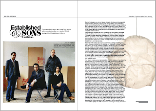
I.E. What one to put in; where to put it; where to put the caption; etc.
The third option is what I'm leaning towards. I feel that the image breaks up the 'square' feel of the layout and ties in with the image on the previous page with the black and red colour.


No comments:
Post a Comment