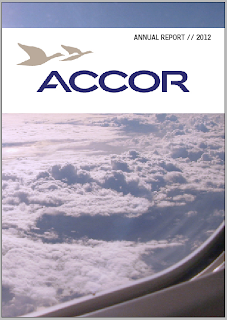
After class critique, I have incorporated blue as my main colour throughout the publication. This helps tie everything in together.
Monday, October 22, 2012
Done and done!
Sorry for the whinging Khim.
After class critique, I have incorporated blue as my main colour throughout the publication. This helps tie everything in together.
After class critique, I have incorporated blue as my main colour throughout the publication. This helps tie everything in together.
Sunday, October 21, 2012
Done...possibly
I have slaved quite a bit over this.
Finding harmony when all pages sat together I have found very difficult. The publication would obviously have a lot more pages and I feel that in the case of designing a whole document of course the pages will have similarity and flow. I have found that with the pages I choose to redesign they would not have all that much link in a proper report and so together they look a tad out-of-place. I feel confident after a few little touches that it works as a whole. However, I am 80% convinced that I don’t want to work on another annual report if I can help it.
Here is my 12 pages that will soon be sent to the printers for the test.
Monday, October 15, 2012
Progression
Work on financial page
Trying to make it work...
I'm trying not to go out of the box with this page because I feel that it needs to stay traditional to remain readable but also showcase the important information. Hierarchy with the finances is important.
Trying to make it work...
I'm trying not to go out of the box with this page because I feel that it needs to stay traditional to remain readable but also showcase the important information. Hierarchy with the finances is important.
Fiddling
Just working with the pages that I have already progressed upon, changing up different things to see how they work.
Slowly working on the financial page - and of course the cover (front and back).
*Seeing how the drop shadow effects the layout (using the layout that I find works best from previous)
Slowly working on the financial page - and of course the cover (front and back).
*Seeing how the drop shadow effects the layout (using the layout that I find works best from previous)
* Swapping up the image in the background to see which is less distracting but still works for the page.
Friday, October 12, 2012
Progressing
Some spread that I am currently working with. Adding elements and taking away to hopefully get a style that works across the board.
Not so sure what to do with the cover as of yet but just playing around with image and type for now.
Overview page, I feel like it should stay corporate but an element of fun can be added within the image, to show their playful side as well.
The first info graphics spread has evolved and still being worked upon, here is what has happened so far.
The second info graphics spread is struggling a little to hold it's own. Looking at what the previous annual report had and trying to incorporate some of that but also enhance it with info-graphics is the challenge.
The financial page is coming along but at the moment I am just copying the text and will hopefully come up with something that fits.
Wednesday, October 10, 2012
Colour Schemes
Possiblilities of colour schemes
Not sure how the colour scheme will end up as but these combinations provide inspiration.
Not sure how the colour scheme will end up as but these combinations provide inspiration.
Subscribe to:
Posts (Atom)


